Tuesday, October 28, 2014

Posters of Protest- Talk to the hand!

On a recent visit to the V&A, I came across a very interesting section of posters. It was called 'Posters of Protest' - a collection of posters from the last 100 years. I am still trying to articulate how and why, they still have that powerful magnetic effect that draws you towards them, mildly hypnotic?

What was it about the design, that makes every poster still look fresh? The fonts? The colours? The cut- colour, the silhouettes? black-white- red?  Or the hand?
So strange, that posters and art from all over the world, had these many things in common. So what was the formula?

It is easier for people to stand for what they are against, than what they support. No. Stop. Resist. 
I read in an article, that the use of silhouettes was deeper than just cool 'graphic design'. It was a technique used to condense a group of people into one unified body.
Iconography: The fist. The arresting hand. To me, this was it. All summed up, the clenched fist shouted power, shouted resistance, shouted unity.


What happened to this kind of art? Why don't we see these anyone? Why am I not designing anything like this? No burning issues for protest today? Or is this the new mantra? 

let's keep calm and shut the fuck up.

Fists to Fingers

I was reading this book '100 ideas that changed graphic design'  by Steven Heller, and the pointing finger' idea is No 6.

'When a finger pointed directly at a word or a sentence it was a benign command to read whatever was pointed out.'

 The pointing finger acquired more gravitas when in 1914, at the outset of WW1, British designer Alfred Leete created the famous recruitment poster featuring a picture of the secretary of state of War, pointing directly of of the poster to the viewer above the words 'wants you'. this was the first of many wartime and post war recruitment posters.

Designed to unite or designed to divide, to bring together or break. I absolutely love the power of design.
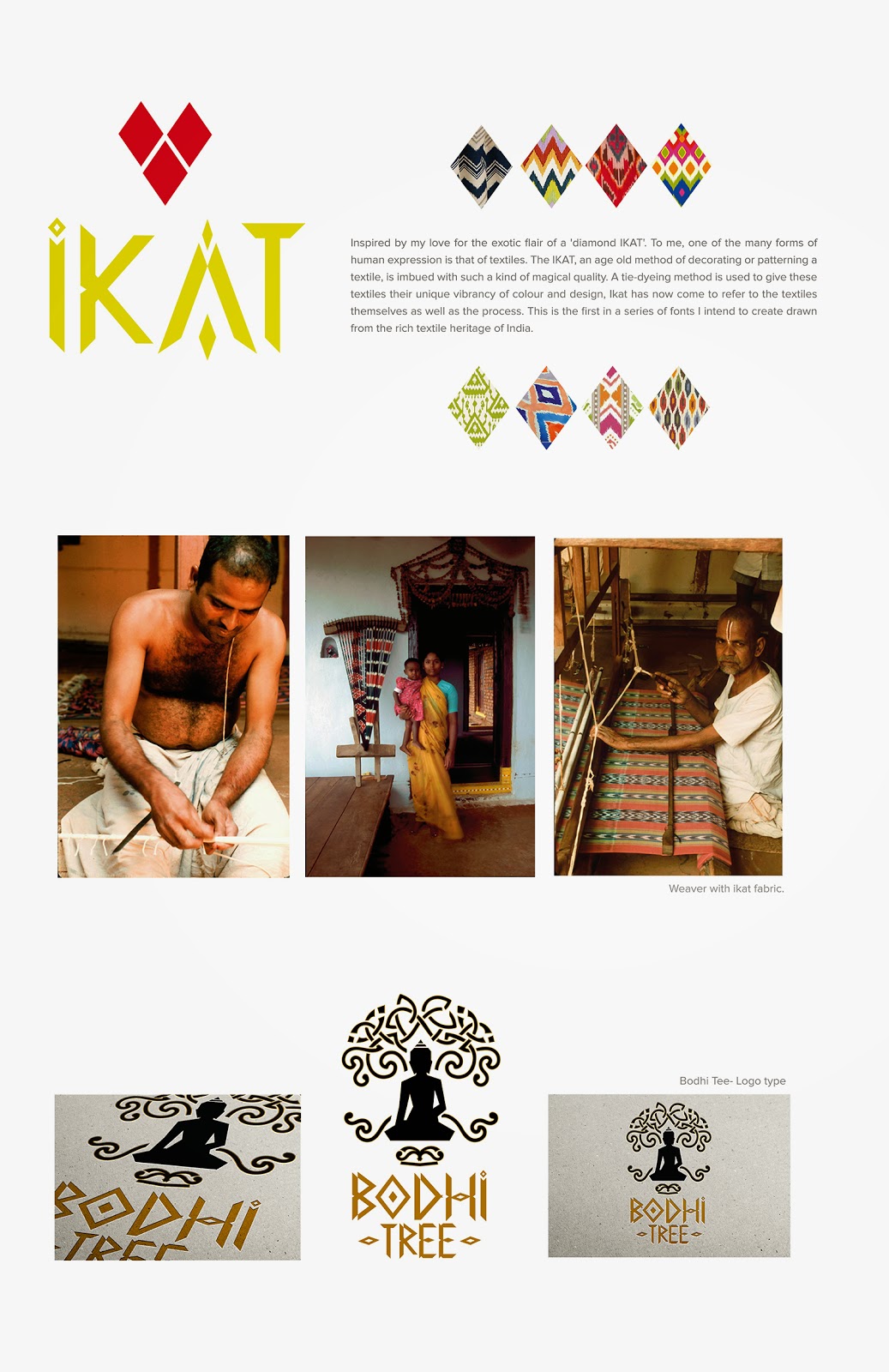


Tuesday, October 21, 2014

My baby is finally taking shape


After completing the summer course on typography, I was itching to create a font. Something from scratch. Something beautiful. And to be honest, I hadn't done anything entirely original in a while and wanted to get my hands dirty! 
And so I embarked on this rather tedious journey of designing the font. After spending weeks wondering where to begin, how to design, and hours of googling, I found a tutorial on youtube on how to create a font using Adobe illustrator. This is exactly what I was looking for.

For any designer who wants to create a font, and doesn't quite understand the technical complexities and mathematics involved, just follow the instructions. It is absolutely critical that you start right, with the correct file size and format so that you don't struggle at the end. Even a tiny error can impact the entire exercise and you might end up re-doing all 52 characters!

Having said that I am nowhere close to end myself, but so far this tutorial has proven very very useful.


I was keen to base my font on something that inspires me, interesting design wise, and also connected me to my roots. I thought about Indian art, Indian architecture and Indian textiles. And there it was... IKAT. It is rich, it is distinctive, it is traditional, and yet so geometric and contemporary. I just knew this was it.

Here's a sample of my work in progress. Far from complete, I still have the entire lower case and numerals to go. And of course all the fine tuning and adjustments. I can clearly see already that the 'O' looks too big! So fingers crossed, I should get this done by the end of the year at least.


Thursday, October 9, 2014

Diving deep into type.. (or just scratching the surface)


I love Type Wolf. I think I have learnt more on typography and fonts in the last one month than I have in many years. I am starting to analyse and justify my various font choices rather than picking something that just 'looks good' or 'feels right'. The texture, the colour. The context.

Why doesn't a Garamond work in large sizes? Does Meta work better than Helvetica?  Why is Lexicon the most expensive font? Why is Futura the most popular and most unpopular? Did we know it was Wes Anderson's and Stanley Kubricks' favourite font?  Why the global outcry when Ikea switched from Futura to Verdana?  Why does this fascinate me?


Most of the fonts popular amongst designers are not free, and some really pricey, but there are quite a few brilliant free options to explore as well.

But it's very important to have an understanding on why a certain font works for a particular project, vs another for something else. The history and evolution of the font, the influences. Subtle semiotics, but  it effects the overall project look and experience. We spoke about this in detail in my course on Typography at Central Saint Martins. We had an interesting assignment where we were given a set of projects and we had to choose fonts for each of them, and the reasoning behind choosing that font. Probably the hardest assignment, but the most fun.

On a separate note, I'm loving this brush pen from Atlantis, and the seemingly endless summer Saturdays. 


Saturday, October 4, 2014

Haunting walks

I had never been to a cemetery.  On a recent visit to Scotland, we were walking down the Royal mile, and I was somehow drawn towards the Cannongate Kirkyard. On a hillock, overlooking the city, it felt like a spot of untouched beauty, that endured the passing of time and the world that grew around, and stood it's ground, imposing. 
I can't help getting all choked up , walking through the gravestones, through people who were loved, some taken away before their time, their stories set in stone, to be read centuries later, by a stranger from the other side of the planet. 
It's the overwhelming feeling of feeling connected and yet disconnected. Intruding... yet not feeling like an intruder.


Down the road is another gem, the Greyfriars Kirkyard. I was most touched by the story of Greyfriars Bobby. Greyfriars Bobby belonged to an Edinburgh city police night watchman. When the watchman died, he was buried in Greyfriars cemetery. Bobby refused to leave his master's grave and spent the rest of his life sitting over it. He never left the spot for nearly fourteen years, till his death. He was then buried close to his master.

A statue and fountain have been erected to commemorate him, 'the most loyal dog in Scotland'


The beauty of the West Cemetery of Highgate, is unsurpassed. It was for me, like walking through Tolkien's Old forest. It probably is one of those hidden treasures in London. Forgotten paths, dead ends, moss covered graves, the stone angels that remind me of the weeping angels from Doctor Who. It's haunting contrast of the burning orange autumn leaves against the cool green moist moss, makes it a magical setting for tales of a distant past. I thought of Neil Gaiman's story of a little boy whose home was a graveyard such as this, in the care of ghosts.