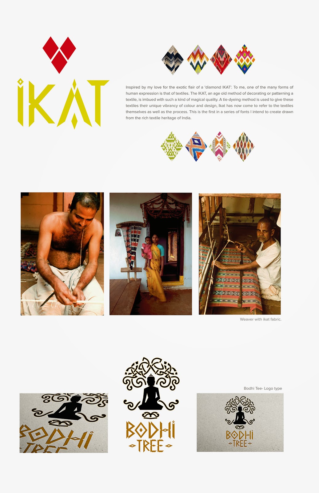
After completing the summer course on typography, I was itching to create a font. Something from scratch. Something beautiful. And to be honest, I hadn't done anything entirely original in a while and wanted to get my hands dirty!
And so I embarked on this rather tedious journey of designing the font. After spending weeks wondering where to begin, how to design, and hours of googling, I found a tutorial on youtube on how to create a font using Adobe illustrator. This is exactly what I was looking for.
For any designer who wants to create a font, and doesn't quite understand the technical complexities and mathematics involved, just follow the instructions. It is absolutely critical that you start right, with the correct file size and format so that you don't struggle at the end. Even a tiny error can impact the entire exercise and you might end up re-doing all 52 characters!
Having said that I am nowhere close to end myself, but so far this tutorial has proven very very useful.
I was keen to base my font on something that inspires me, interesting design wise, and also connected me to my roots. I thought about Indian art, Indian architecture and Indian textiles. And there it was... IKAT. It is rich, it is distinctive, it is traditional, and yet so geometric and contemporary. I just knew this was it.
Here's a sample of my work in progress. Far from complete, I still have the entire lower case and numerals to go. And of course all the fine tuning and adjustments. I can clearly see already that the 'O' looks too big! So fingers crossed, I should get this done by the end of the year at least.


.jpg)

No comments:
Post a Comment