Saturday, February 20, 2016

My Etsy Journey Part 3: Discovering Giclee

So it's been a great start to the weekend. I designed a fresh print for David Bowie, and I got an order the very next day from New York.

Happy Days :-)

The Giclee Prints look lovely, and that's anther discovery for me. I love Giclee. The light texture paper made of organic cotton rag. The archival inks that stay bright for years, unlike a digital prints which eventually fades over time.

And, for me it was the first time I actually got to 'sign' something. Actually I was instructed to :-)
It was a bit daunting. I was nervous, even googled on 'how to sign an art print'. Seriously didn't want to ruin a print with lousy handwriting. Practised it a hundred times with different pencils on all kinds of paper.

My Etsy experience has been pretty great so far. I will be sharing many more posts on my journey. Stay tuned. Meanwhile, here are some fresh Giclee prints.

www.eyeforlondonprints.etsy.com

David Bowie: The Tiger lives on...


Pink Floyd: A Bizarre collection of Curios

Saturday, February 13, 2016

My Etsy Journey Part 2: A Valentine special Art print of London's sweetheart - Amy Winehouse.

It's Valentines. It's a busy time on Etsy with everyone tagging 'Valentines gifts' or 'Gifts for her'. Jewellery, clothes, flowers, cupcakes, heart shaped cards...the whole shebang. 
I'm embracing Valentines in my own way, with my Valentine. My wonderful husband of six years. He is a brilliant writer and illustrator, and the guy who kicked my butt and pushed me to get on to Etsy. 

We made this print of Amy- the sweetheart of London. 


Those eyes....

Amy Winehouse. The Camden sweetheart we all fell in love with. Amy's voice continues to sing about love, heartbreak and such bitter sweet joys. Forever remembered.

So we watched the Amy documentary together the other day, it was a beautiful candid insight into her life. The swift rise to fame, and how it all began to unravel towards the end. Sad, sweet and scary unpredictable. Complicated, yet tender, her struggles around family, fame and addiction. It captures the very heart of what she was about, a true musical genius.

Limited edition Giclee Prints of Amy Winehouse 'Tears die on their own' now available on Eye for London Prints on Etsy

www.eyeforlondonprints.etsy.com


Sunday, January 31, 2016

My Etsy Journey Part 1: Launching Eye For London Prints

Unusual graphic Art Print and Posters of London

After two whole years in London (to the day), I still find myself falling in love with the city a little more everyday. Kicking off year three, I have launched my own Print Shop on Etsy. This personal project features graphic illustrations through stories in architecture design and pop culture, exploring the often overlooked yet interesting facets that lend character to the city of London. From Bowie and Brutalism, to the books people are reading on the tube. This is London through my eyes.

www.eyeforlondonprints.etsy.com

Tuesday, March 17, 2015

The Owlthulhu

East London: Shoreditch and Bricklane are some places fromm where I derive my greatest inspirations. The street art- the best in London is so fresh, current and deliciously bizarre. It's ever- changing, and in every visit I see new work that didn't exist before.

One piece of work I absolutely couldn't get out of my mind, were the paintings of Alexis Diaz. The weird- steam-punk lovecraft-ian creatures are those you cannot 'unsee'

So I was super excited when I got an opportunity to design a logo for 'Bedlam & Boss', a designer boutique label.

My clients were Lorna and Kay- a creative couple who design eclectic furniture and furnishings. I rarely come across 'dream clients' , but both Lorna and Kay love 'weird and steampunk'

The idea was to create something that brought alive both their personalities:

Lorna: the wise half
Kay: the wild and crazy

So here goes.... My 'Owlthulhu'

works of Alexis Diaz in Bricklane


Friday, January 30, 2015

Legal Alien

As I was walking back from lunch, I was stopped in my tracks by a gentleman.  He asked me if I could help him, and had 50p to spare. I usually try and avoid these confrontations, and end up walking away with an awkward nod... but this man held an expression so full of hope and anticipation, and I didn't think twice before fishing out the 50p from my bag.

He told me that he was living in the streets for the past month or so. He had moved to London from another country and since then it had been a struggle. 

I don't know, maybe I could empathise with him in some way.  As an immigrant here today, I find myself feeling the same helplessness. It's not the struggle for food and shelter kind of helplessness, but it the feeling of 'where will I be in the next six months'.

London is cold, and not just this winter. 

It's not a city where jobs are accessible to foreigners.

It's not a city where they have the luxury to shop, bargain or negotiate for the 'dream' position.

To an immigrant, this city is a drug, an addiction, and they will do... close to anything to stay afloat, survive and hope to catch a lucky break, in a few months.... a few years.

I hope the man I met today, finds a home, finds some place warm, and is one of the lucky ones to catch that break.

Wednesday, December 3, 2014

Rich Door- Poor Door

As one lane takes you through canvases of beautiful art, another hits you with a whiff of warm Bengali spices, and you walk down to marvel at a massive chimney of an old brewery or you wander away losing yourself in alleyways of street boutiques and vintage markets. What more would you want? A charming little factory what makes bells, or a narrow gully home to the largest anarchist bookshop in the city. Or perhaps a mysterious night walk with Ripper tales.

Aldgate East, Brick Lane, Whitechapel.

Brick Lane


It is the London I want to be a part of, proud of. A meting pot of cultures, free thinking, free people.

That's until it became an 'investment opportunity'. 'One Commercial Street Tower'-  twenty one storey eyesore. There is no better way to describe that, but then again I hate tall glass characterless buildings. They seem to lack a soul.

But that is not my issue. Sky scrapers seem to be the answer to growing population in super cities. What's disturbing is what I read at the 'East End Howler', a local newspaper I picked up from the Freedom Bookstore. Apparently developers are 'sometimes forced' to provide housing that could be passed as affordable (still beyond reach for the average Londoner). The end result, the developer is faced with a situation where the desired residents will be living in the same building as the undesirables. (cringe)
The solution devised by Redrow (the builder) is to have two separate entrances.  The main entrance (rich door) has a vast lobby and security guards and an upscale reception, while the 'poor door' is around in a dingy side alley with nothing welcoming in the narrow access except mailboxes.


This has not gone unnoticed. There have been protests every week against this ridiculous hypocrisy. The protesters have talked to residents of both doors. One of them coming out of the rich door did not even know there was a poor door. (.really?) Some of the poor door residents have revealed more details of the discrimination. The lift frequently breaks down and they are not allowed to use the rich lift!

This is no longer about 'abolishing' the two doors. Maybe the builder will eventually be forced to do it, but what is really happening here? The bloody immigrants? This area has been the heart of the Bangladeshi Bengali community for decades, so what next... The Apartheid in East London?


Rich and poor entrances

Latest update(Nov 27): Round 1 goes to the Poor Doors. Richie Rich have agreed to 'talks' regarding the abolishment of the poor door. I walked around this building today, and there were quite a few cops lurking at the entrance, but no protesters.


Voices of the working class. Newspapers at the Freedom Bookshop

I admire the will and the dedication with which people are writing and publishing such journals for free distribution. What's the motivation? Maybe 10 people will read it. Maybe five will blog about it. Being aware and being alert. It is important for the information to be shared and passed on.

Tuesday, October 28, 2014

Posters of Protest- Talk to the hand!

On a recent visit to the V&A, I came across a very interesting section of posters. It was called 'Posters of Protest' - a collection of posters from the last 100 years. I am still trying to articulate how and why, they still have that powerful magnetic effect that draws you towards them, mildly hypnotic?

What was it about the design, that makes every poster still look fresh? The fonts? The colours? The cut- colour, the silhouettes? black-white- red?  Or the hand?
So strange, that posters and art from all over the world, had these many things in common. So what was the formula?

It is easier for people to stand for what they are against, than what they support. No. Stop. Resist. 
I read in an article, that the use of silhouettes was deeper than just cool 'graphic design'. It was a technique used to condense a group of people into one unified body.
Iconography: The fist. The arresting hand. To me, this was it. All summed up, the clenched fist shouted power, shouted resistance, shouted unity.


What happened to this kind of art? Why don't we see these anyone? Why am I not designing anything like this? No burning issues for protest today? Or is this the new mantra? 

let's keep calm and shut the fuck up.

Fists to Fingers

I was reading this book '100 ideas that changed graphic design'  by Steven Heller, and the pointing finger' idea is No 6.

'When a finger pointed directly at a word or a sentence it was a benign command to read whatever was pointed out.'

 The pointing finger acquired more gravitas when in 1914, at the outset of WW1, British designer Alfred Leete created the famous recruitment poster featuring a picture of the secretary of state of War, pointing directly of of the poster to the viewer above the words 'wants you'. this was the first of many wartime and post war recruitment posters.

Designed to unite or designed to divide, to bring together or break. I absolutely love the power of design.


Tuesday, October 21, 2014

My baby is finally taking shape


After completing the summer course on typography, I was itching to create a font. Something from scratch. Something beautiful. And to be honest, I hadn't done anything entirely original in a while and wanted to get my hands dirty! 
And so I embarked on this rather tedious journey of designing the font. After spending weeks wondering where to begin, how to design, and hours of googling, I found a tutorial on youtube on how to create a font using Adobe illustrator. This is exactly what I was looking for.

For any designer who wants to create a font, and doesn't quite understand the technical complexities and mathematics involved, just follow the instructions. It is absolutely critical that you start right, with the correct file size and format so that you don't struggle at the end. Even a tiny error can impact the entire exercise and you might end up re-doing all 52 characters!

Having said that I am nowhere close to end myself, but so far this tutorial has proven very very useful.


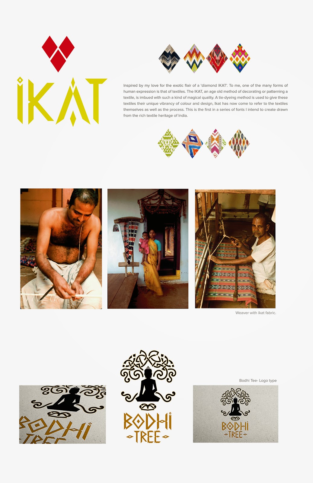
I was keen to base my font on something that inspires me, interesting design wise, and also connected me to my roots. I thought about Indian art, Indian architecture and Indian textiles. And there it was... IKAT. It is rich, it is distinctive, it is traditional, and yet so geometric and contemporary. I just knew this was it.

Here's a sample of my work in progress. Far from complete, I still have the entire lower case and numerals to go. And of course all the fine tuning and adjustments. I can clearly see already that the 'O' looks too big! So fingers crossed, I should get this done by the end of the year at least.


Thursday, October 9, 2014

Diving deep into type.. (or just scratching the surface)


I love Type Wolf. I think I have learnt more on typography and fonts in the last one month than I have in many years. I am starting to analyse and justify my various font choices rather than picking something that just 'looks good' or 'feels right'. The texture, the colour. The context.

Why doesn't a Garamond work in large sizes? Does Meta work better than Helvetica?  Why is Lexicon the most expensive font? Why is Futura the most popular and most unpopular? Did we know it was Wes Anderson's and Stanley Kubricks' favourite font?  Why the global outcry when Ikea switched from Futura to Verdana?  Why does this fascinate me?


Most of the fonts popular amongst designers are not free, and some really pricey, but there are quite a few brilliant free options to explore as well.

But it's very important to have an understanding on why a certain font works for a particular project, vs another for something else. The history and evolution of the font, the influences. Subtle semiotics, but  it effects the overall project look and experience. We spoke about this in detail in my course on Typography at Central Saint Martins. We had an interesting assignment where we were given a set of projects and we had to choose fonts for each of them, and the reasoning behind choosing that font. Probably the hardest assignment, but the most fun.

On a separate note, I'm loving this brush pen from Atlantis, and the seemingly endless summer Saturdays. 


Saturday, October 4, 2014

Haunting walks

I had never been to a cemetery.  On a recent visit to Scotland, we were walking down the Royal mile, and I was somehow drawn towards the Cannongate Kirkyard. On a hillock, overlooking the city, it felt like a spot of untouched beauty, that endured the passing of time and the world that grew around, and stood it's ground, imposing. 
I can't help getting all choked up , walking through the gravestones, through people who were loved, some taken away before their time, their stories set in stone, to be read centuries later, by a stranger from the other side of the planet. 
It's the overwhelming feeling of feeling connected and yet disconnected. Intruding... yet not feeling like an intruder.


Down the road is another gem, the Greyfriars Kirkyard. I was most touched by the story of Greyfriars Bobby. Greyfriars Bobby belonged to an Edinburgh city police night watchman. When the watchman died, he was buried in Greyfriars cemetery. Bobby refused to leave his master's grave and spent the rest of his life sitting over it. He never left the spot for nearly fourteen years, till his death. He was then buried close to his master.

A statue and fountain have been erected to commemorate him, 'the most loyal dog in Scotland'


The beauty of the West Cemetery of Highgate, is unsurpassed. It was for me, like walking through Tolkien's Old forest. It probably is one of those hidden treasures in London. Forgotten paths, dead ends, moss covered graves, the stone angels that remind me of the weeping angels from Doctor Who. It's haunting contrast of the burning orange autumn leaves against the cool green moist moss, makes it a magical setting for tales of a distant past. I thought of Neil Gaiman's story of a little boy whose home was a graveyard such as this, in the care of ghosts.